Responsive Images Demo
How to use PICTURE and SRCSET in HTML 5 to display images for different screen sizes

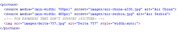
Here's the HTML 5 code that displays the aircraft photos on this page:
To see different pictures loading at different viewport sizes, just resize your browser window by pulling the right side in. At any width, the PICTURE element and SRCSET attribute will load the picture that satisfies the minimum window width set in the code.
The browser looks for the first source element where the media query matches the viewport width, and loads the image specified in the SRCSET attribute.
The IMG element is required immediately before the closing PICTURE tag as a backstop for browsers that don't support the PICTURE element, or in case none of the source tags match.
There's nothing magic about the image dimensions and min-width dimensions I've used in this example. For best results, you'll need to play around some with the actual pixel sizes of your images and the min-width attributes in the SOURCE tags. This isn't difficult. Just test everything before you make your pages live.
NOTE: If you're using a recent version of the Chrome browser, you won't be able to reduce window width to less than around 400-500 pixels (depending on resolution setting). To see this page in a narrower window that can display all 3 of the photos, just right-click anywhere in the page and on the menu that opens click Inspect. That will open an Inspector window to the right of this page, and you'll be able to narrow the browser window so that this page fully compresses.
Do you want more and higher-quality website traffic and more conversions? Get a free consultation to learn how I can help you do that. Just complete and send this form to contact me today.
Contact me:
David H. Boggs, MSSEO for Sales System SM
Boothbay Harbor, Maine
207-579-1555
Boston, Massachusetts
617-396-3003
Contact